Conversion-Focused Web Design: Blend Aesthetics with Frontend Performance
The digital landscape in 2026 has moved past the era where a “pretty” website was enough. Today, users decide whether to stay or leave in less than two seconds.
This split-second judgment isn’t just about the colors you use; it’s about how fast those colors appear and how smoothly the interface responds to a touch. To succeed, businesses must bridge the gap between high-end visual appeal and technical efficiency.
Why Conversion-Focused Web Design Matters in 2026
Businesses pour cash into websites, but many flop on results. A site that grabs eyes and keeps users clicking buys is gold. Conversion-focused design puts performance first, think fast loads paired with clean looks.
In web development trends today, speed kills abandonment. Google data shows 53% of mobile users ditch pages that take over 3 seconds to load. Pair that with modern web UI elements like smooth buttons and intuitive nav, and you cut bounce rates.
Real estate sites, for example, win big here. A Dubai property portal slashed load times by 40% using frontend optimization, jumping conversions from inquiries by 25%. It’s not magic, it’s smart choices.
Balancing Chic Web Design with Real Performance
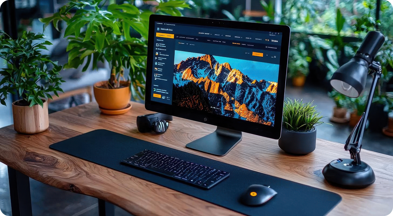
Chic web design turns heads, but it can’t slow things down. High-res images or fancy animations can slow down the speed if not handled properly. The fix? Lazy loading and optimised formats like WebP.
Take e-commerce UX. Shoppers scan fast. A hero image of a product loads crisply, but the page stays snappy thanks to compressed assets. Tools like ImageOptim shrink files without losing punch.
Here’s a quick table comparing common design choices and their speed impact:
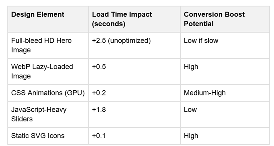
This setup keeps modern web UI fresh without punishing users on slower connections, common in emerging markets.
Balancing Visuals with Frontend Optimisation
The biggest challenge for designers is maintaining a chic web design while hitting those green scores on Google’s Core Web Vitals. Here is how the industry is handling the trade-off:
Smart Asset Loading
Gone are the days of loading every image as soon as the home page opens. We now use native lazy loading and “Priority Hints” to tell the browser exactly which assets are needed for the “above-the-fold” content. This ensures the hero section is visible almost instantly while the rest of the page loads quietly in the background.
Variable Fonts
Instead of calling five different font weights from a server (which requires five separate HTTP requests), developers are switching to Variable Fonts. A single file contains all the weights and styles, significantly cutting down on render-blocking resources.
PHP Development in the Modern Stack
While frontend frameworks like React and Vue get a lot of attention, PHP development remains a powerhouse for the backend of high-performing e-commerce sites. Modern PHP (version 8.3+) is faster than ever.
When paired with a “headless” architecture, PHP serves the data via an API, allowing a lightweight frontend to display it. This separation ensures that complex server-side logic doesn’t slow down the user’s visual experience.
Technical Checklist for High-Performance Design
To ensure your site meets the standards of 2026 Web Development Trends, follow these specific steps:
- Image Formats: Replace JPEGs with AVIF or WebP. These formats offer superior compression without losing the “premium” look of your photography.
- Minification: Always minify CSS and JavaScript files to remove unnecessary characters and white space
- Edge Delivery: Use a Content Delivery Network (CDN) to serve your site’s assets from the server closest to the user’s physical location.
- Accessibility: Ensure your Modern Web UI is fully navigable via keyboard. Accessibility is no longer an “extra”, it is a ranking factor and a legal standard.
- Micro-Caching: Implement server-side caching to deliver static versions of dynamic pages to repeat visitors.
- Eliminate Layout Shift: Set explicit width and height attributes for images and video to prevent the page from “jumping” as it loads.
The Role of Personalisation
As we look deeper into Conversion-Focused Design, we see that one size no longer fits all. Adaptive interfaces now change based on user behaviour. If a visitor has looked at your “Sale” section three times, the hero banner might automatically update to show a discount code.
This level of personalisation requires a tight integration between your design and your data. However, the rule of performance still applies: if the logic that determines the personalised content takes 3 seconds to run, the user will be gone before they see the offer. This is where efficient PHP development and edge computing come into play, processing data at lightning speed to keep the UI fluid.
Final Practical Tips
Creating a site that is both beautiful and fast isn’t a one-time task; it is an ongoing process of refinement.
- Test on Real Devices: Don’t just look at your site on a high-end MacBook. Test it on a mid-range Android phone on a 4G connection. That is where you will see the real friction.
- Audit Your Scripts: Every third-party script (tracking pixels, chat widgets, etc.) adds weight. If a tool isn’t providing clear value to your conversion rate, remove it.
- Visual Hierarchy: Use size and colour contrast to guide the eye. A “chic” design often uses plenty of white space. This isn’t just a style choice; it helps the user focus and reduces the number of elements the browser has to render at once.
By focusing on these frontend optimisation techniques, you can build a digital presence that doesn’t just attract visitors with its looks but keeps them engaged with its speed. In the end, the most “chic” thing a website can be is functional.